-
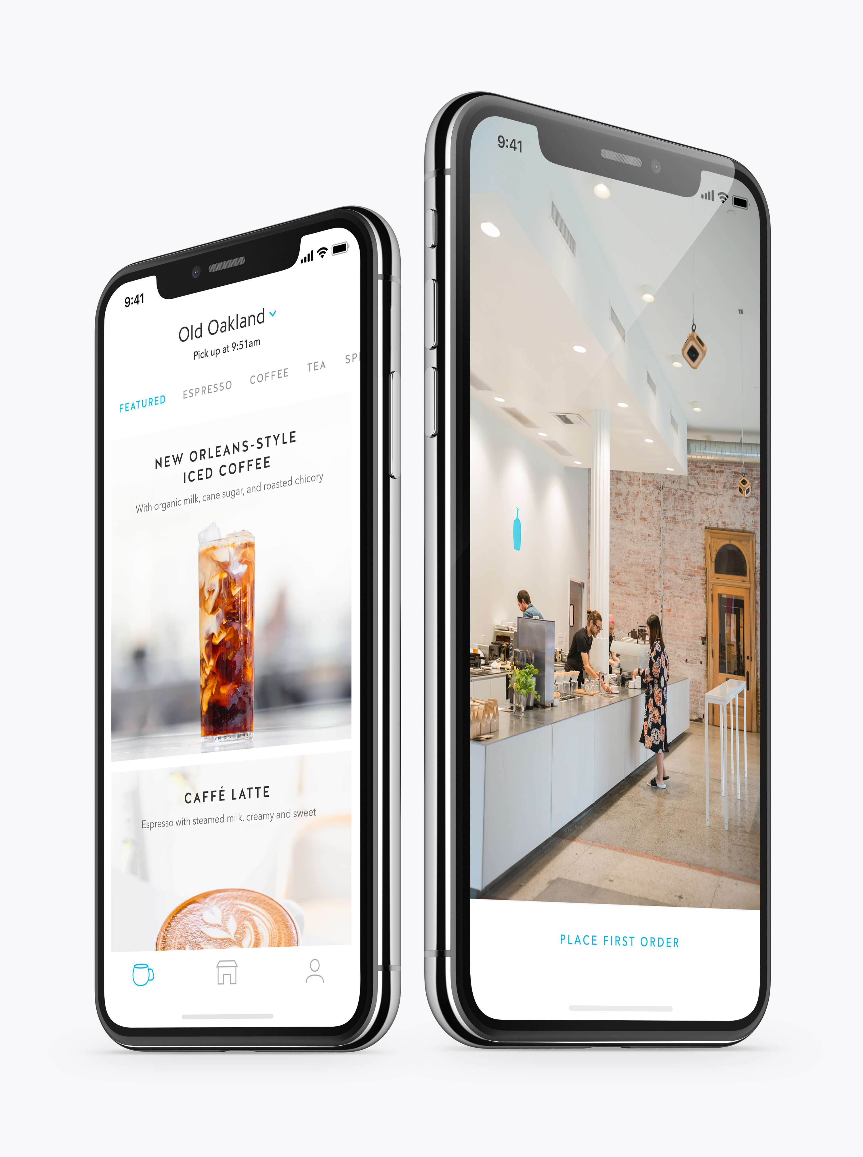
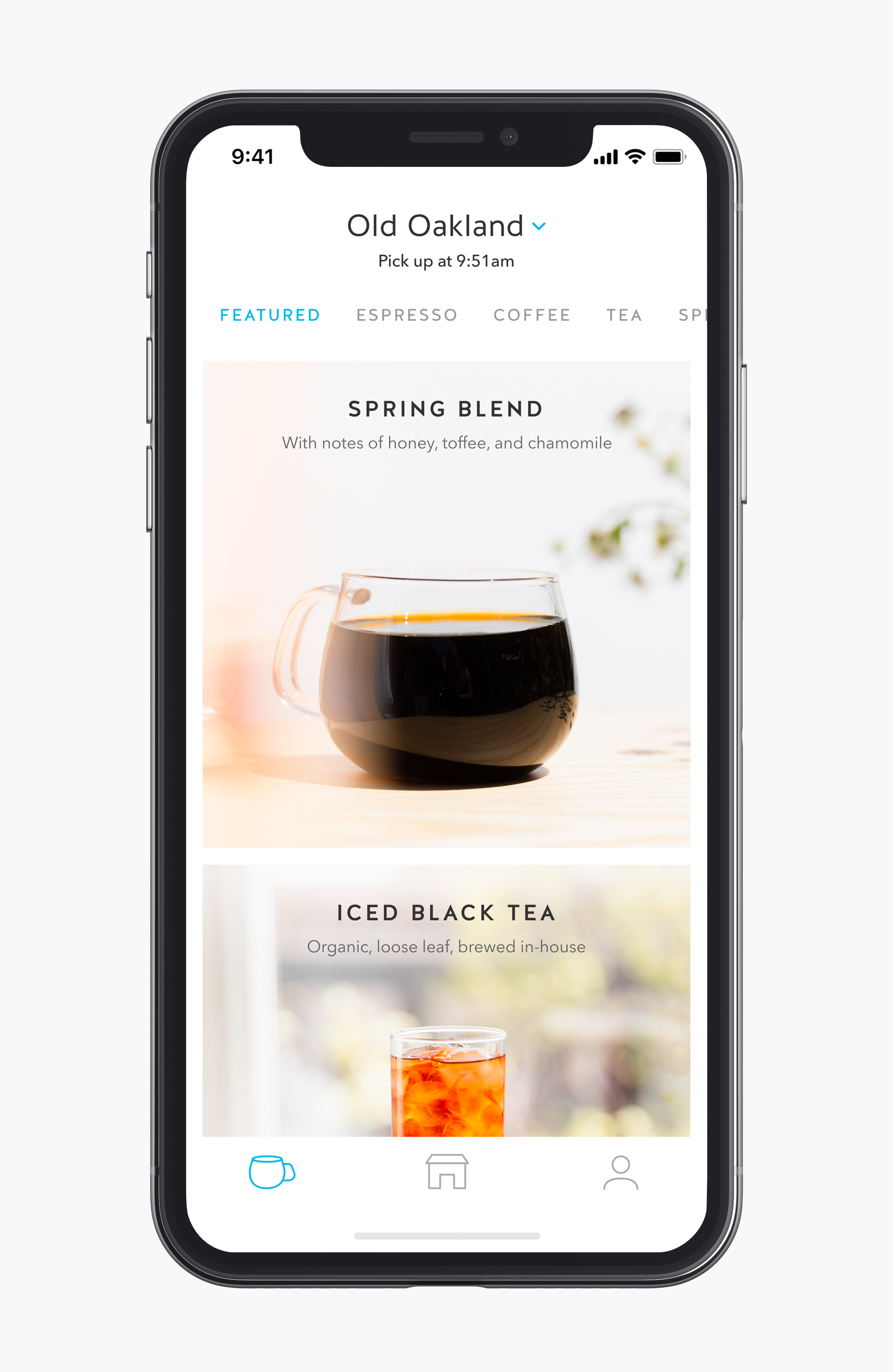
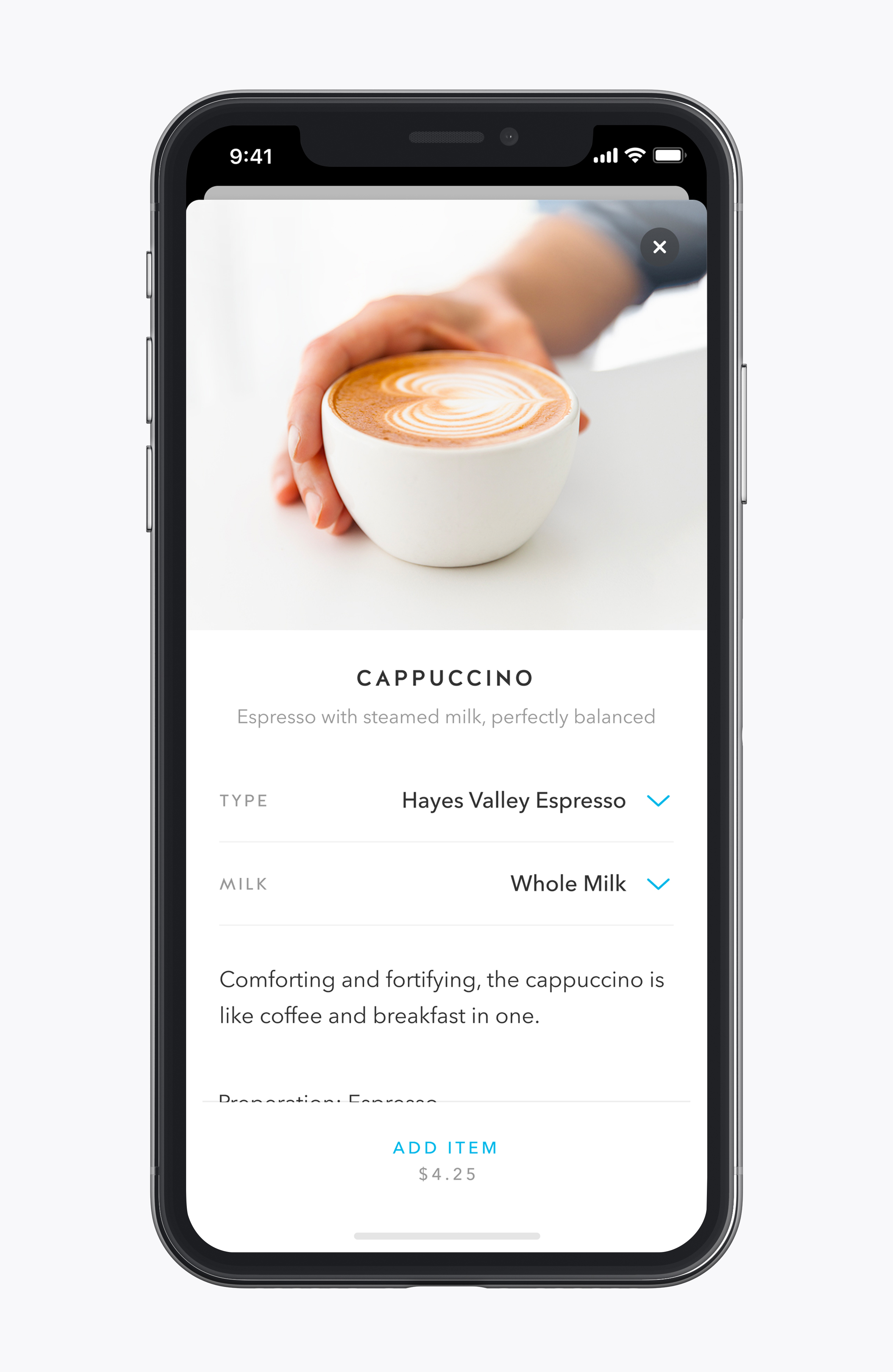
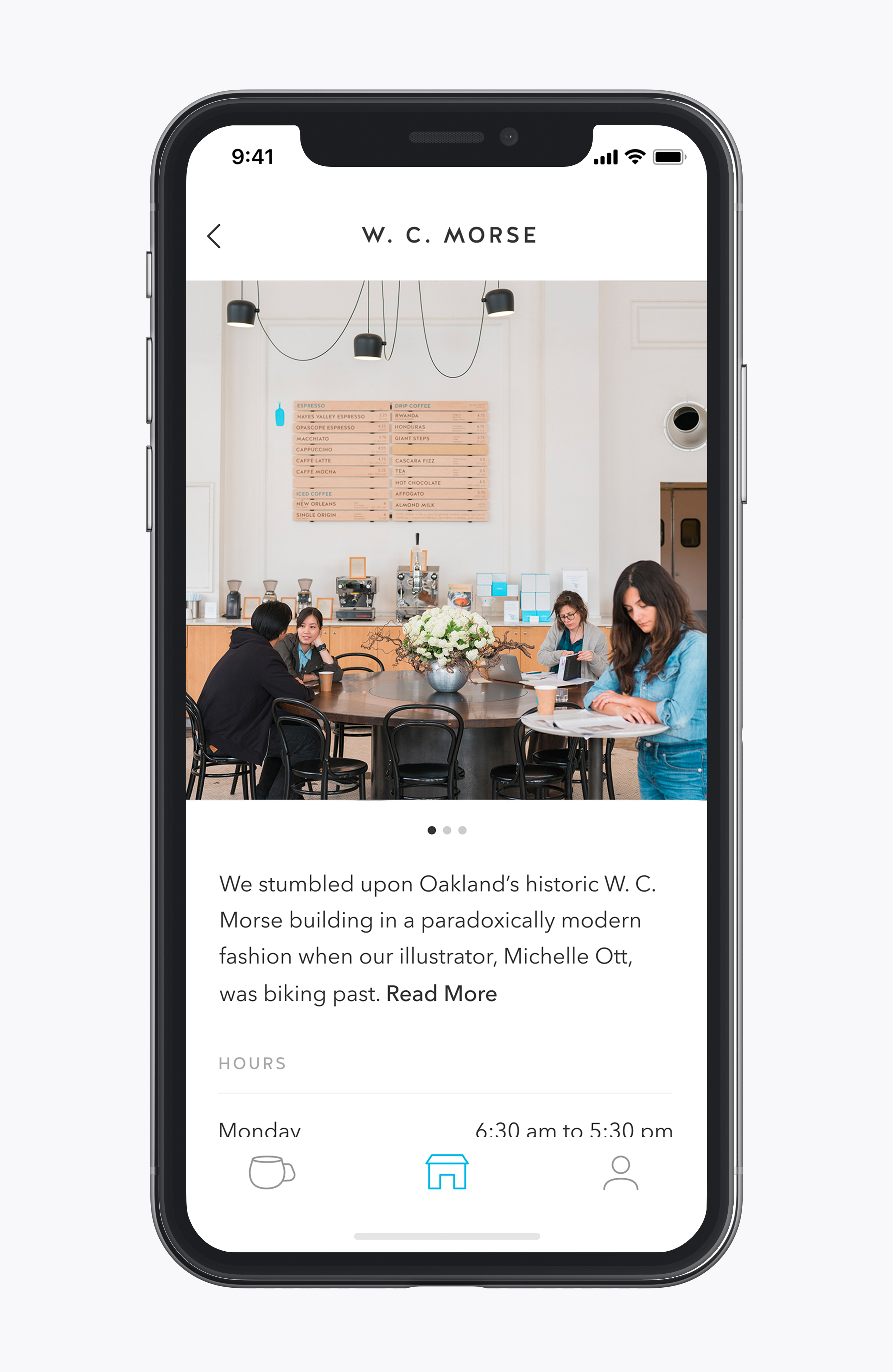
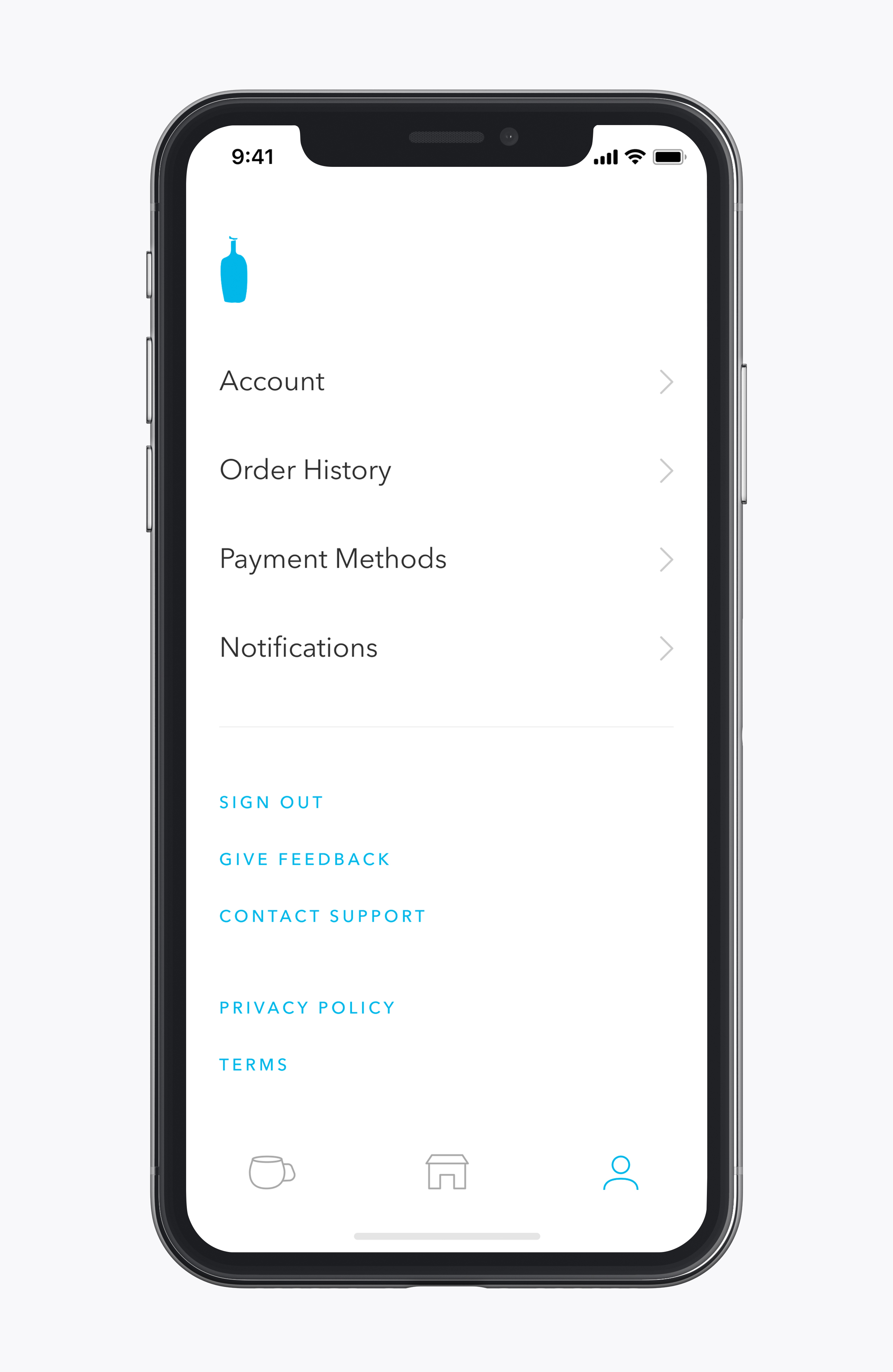
Blue Bottle Coffee
2019
-
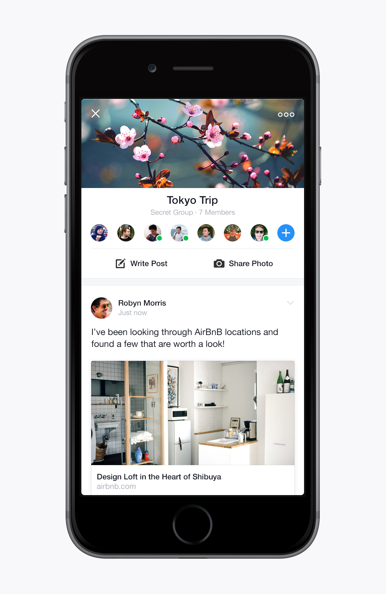
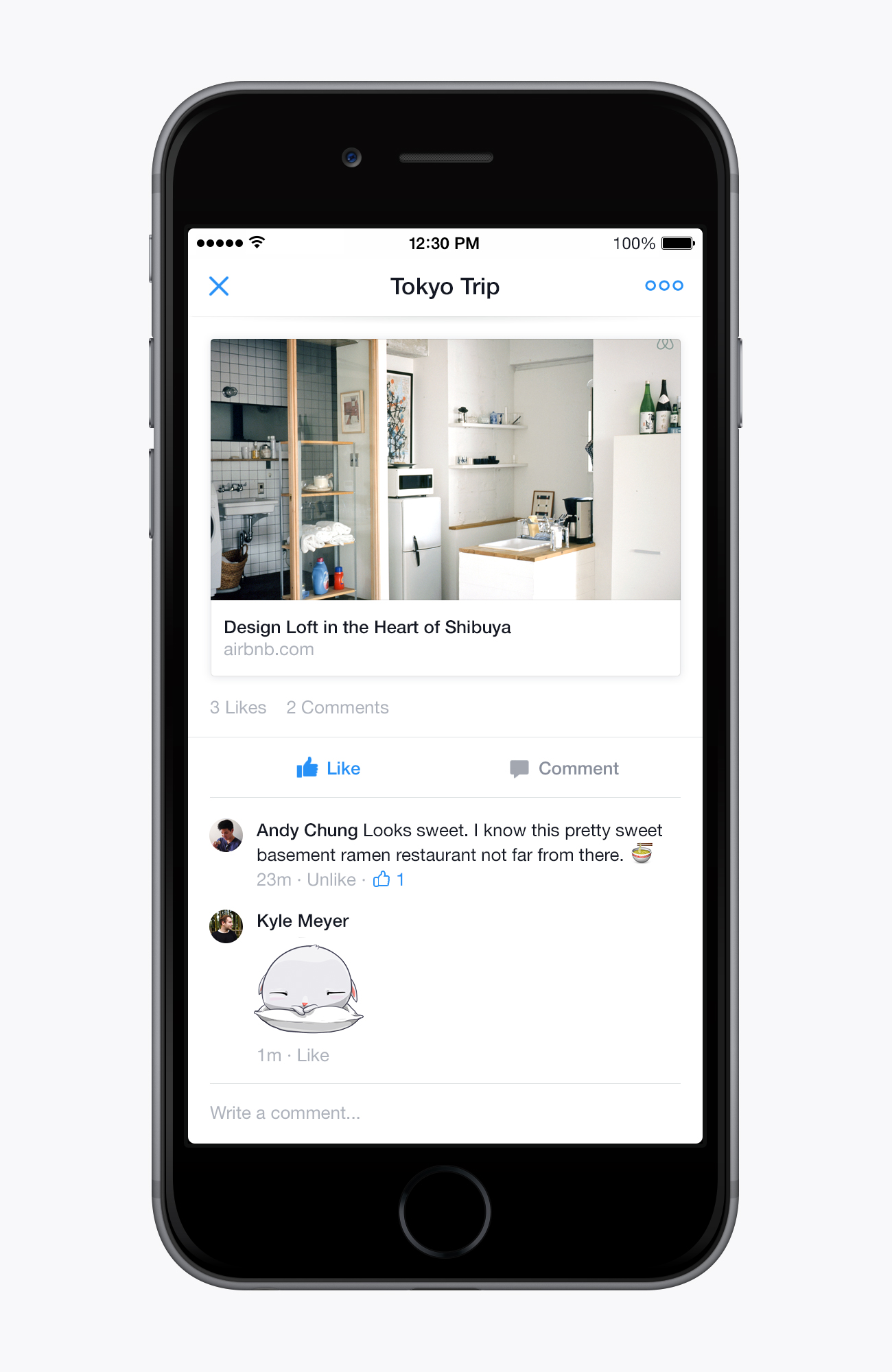
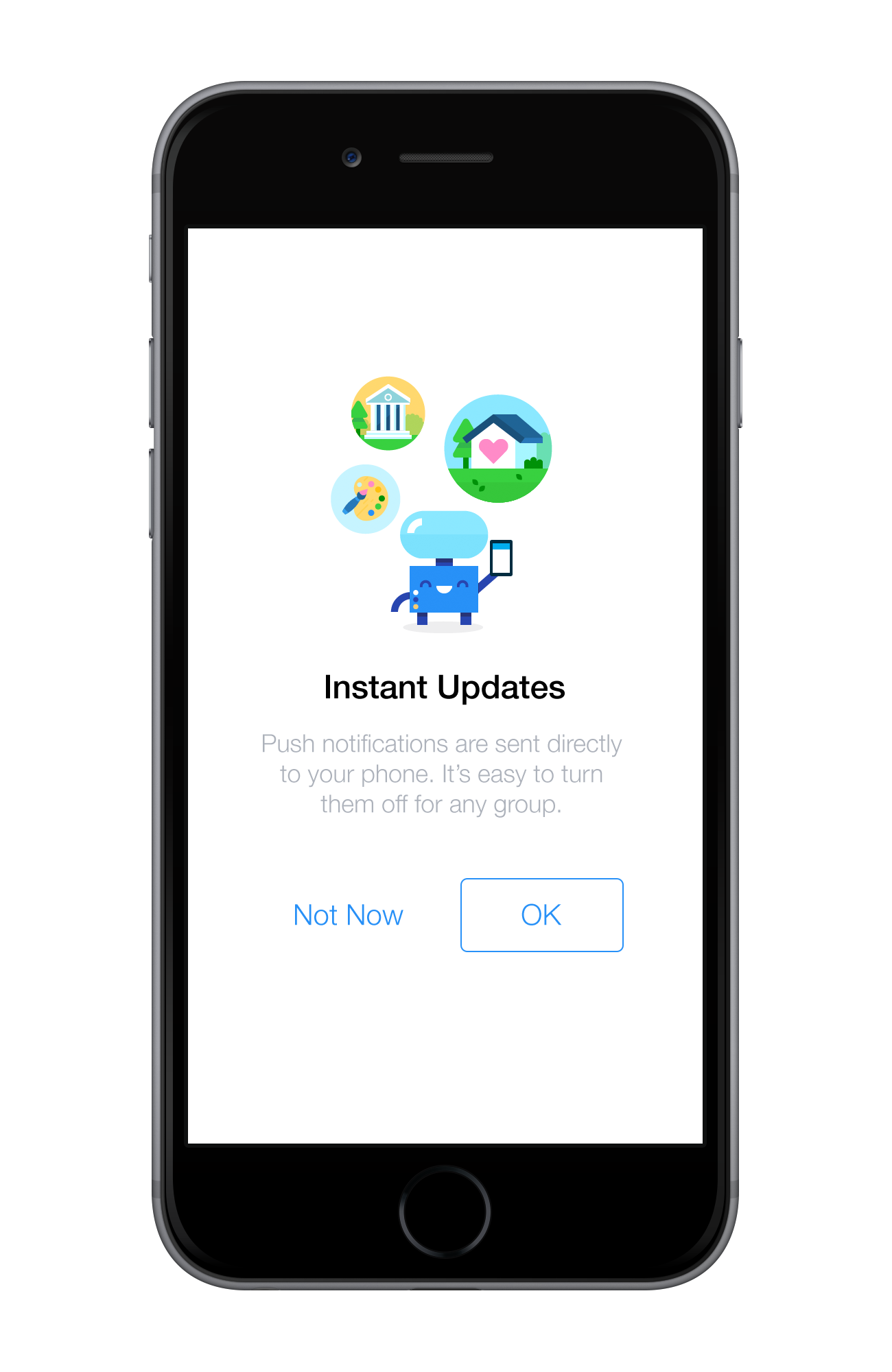
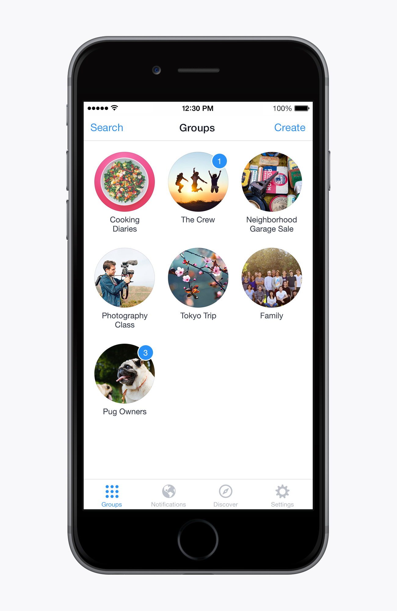
Facebook Groups
2014 – 2015 Lead Designer
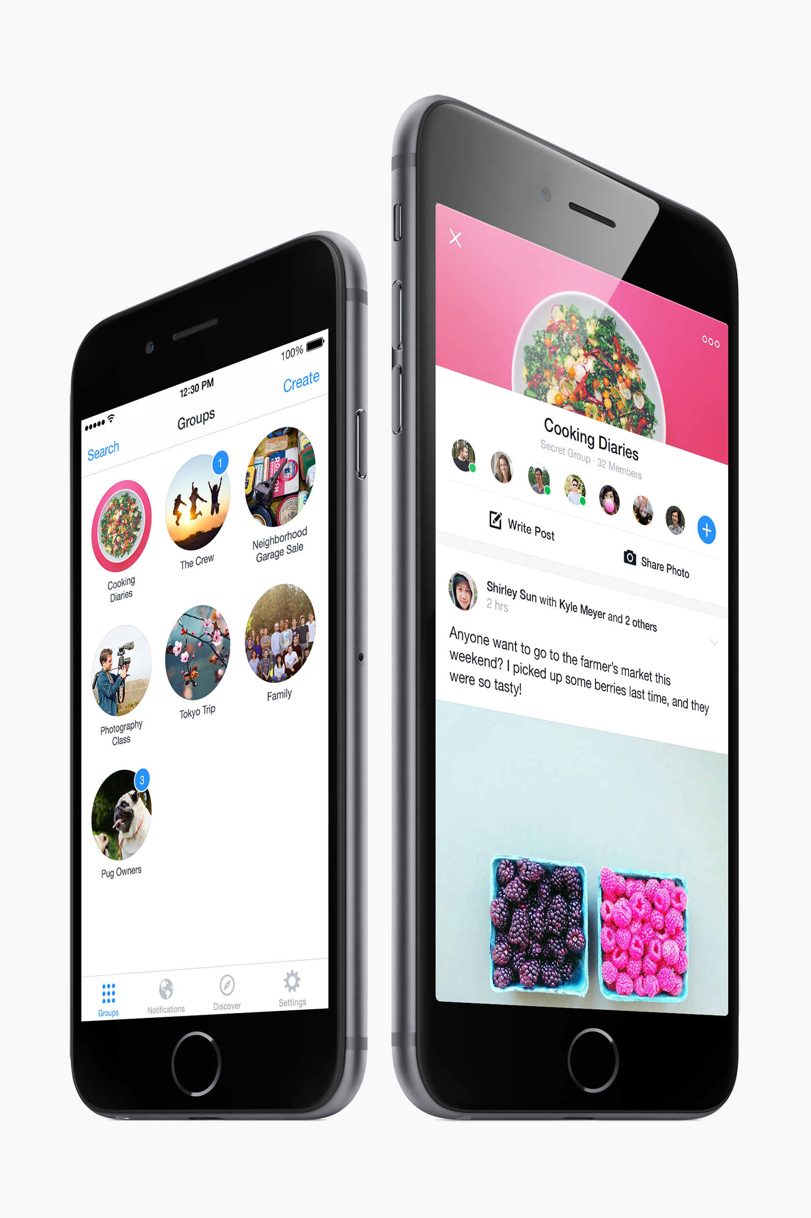
I wouldn’t be surprised if I use it every day. ...the Groups app turns Facebook into a place that’s all about my own interests — and leaves me wanting to hang out there even more than I already do. Fast Company
We’ve been using the app for a few days now and found it to be fast, fluid, intuitive, and surprisingly fun. That’s not a huge surprise — it comes in part from Facebook’s Creative Labs, which has been responsible for other polished Facebook apps like Paper and Slingshot. The Verge
All credit to Facebook — the Groups app is prettily designed and laid out in a simple and accessible way. It’s been crafted to feel more like a private forum than an email thread. Wired
-
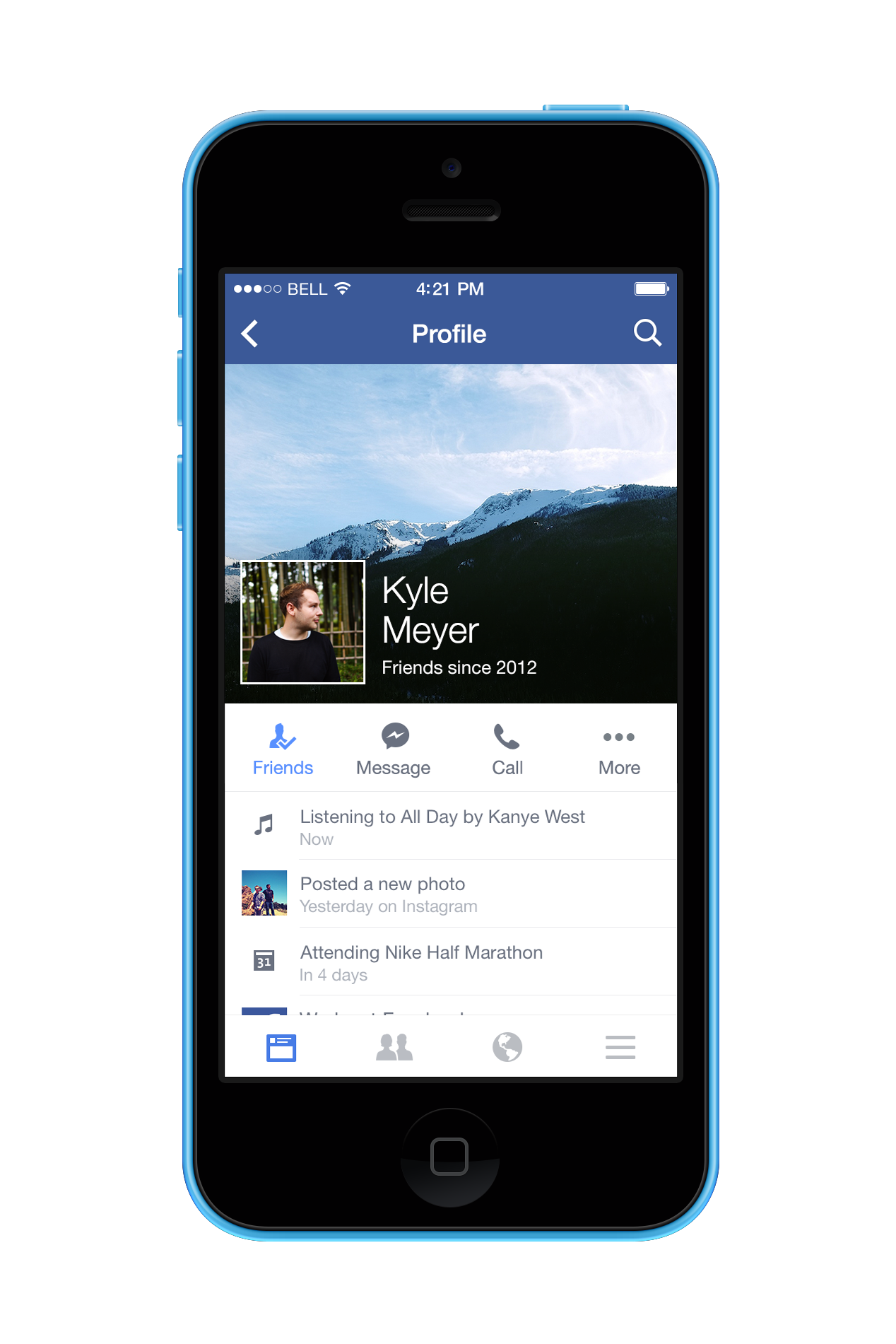
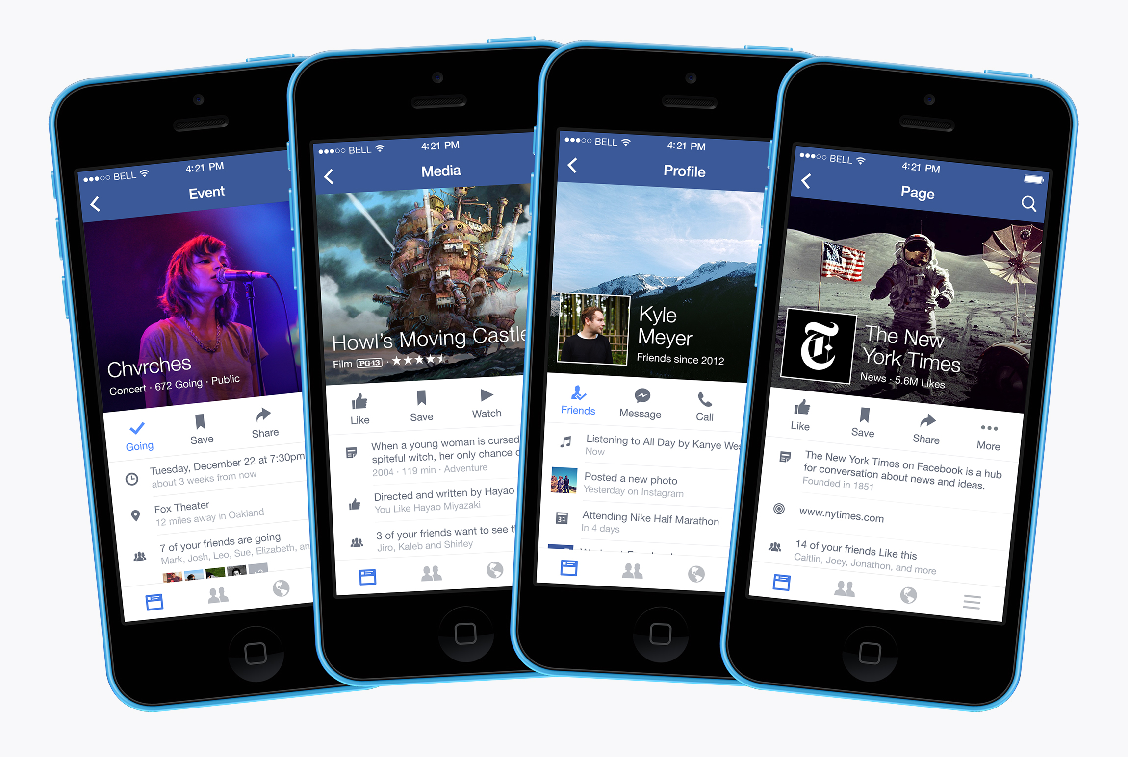
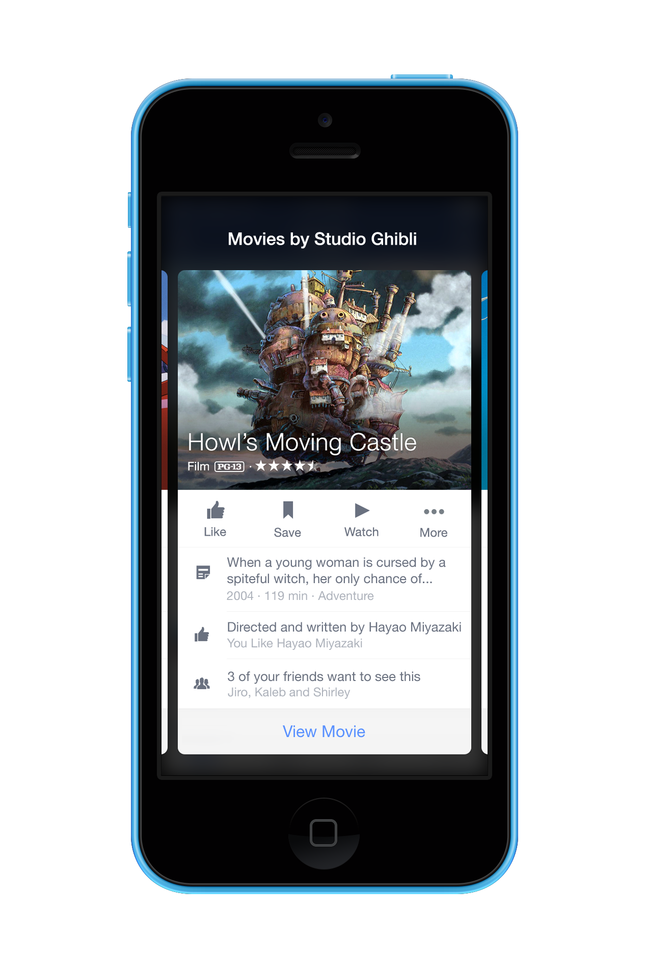
Facebook Profiles
2013 Lead Designer
-
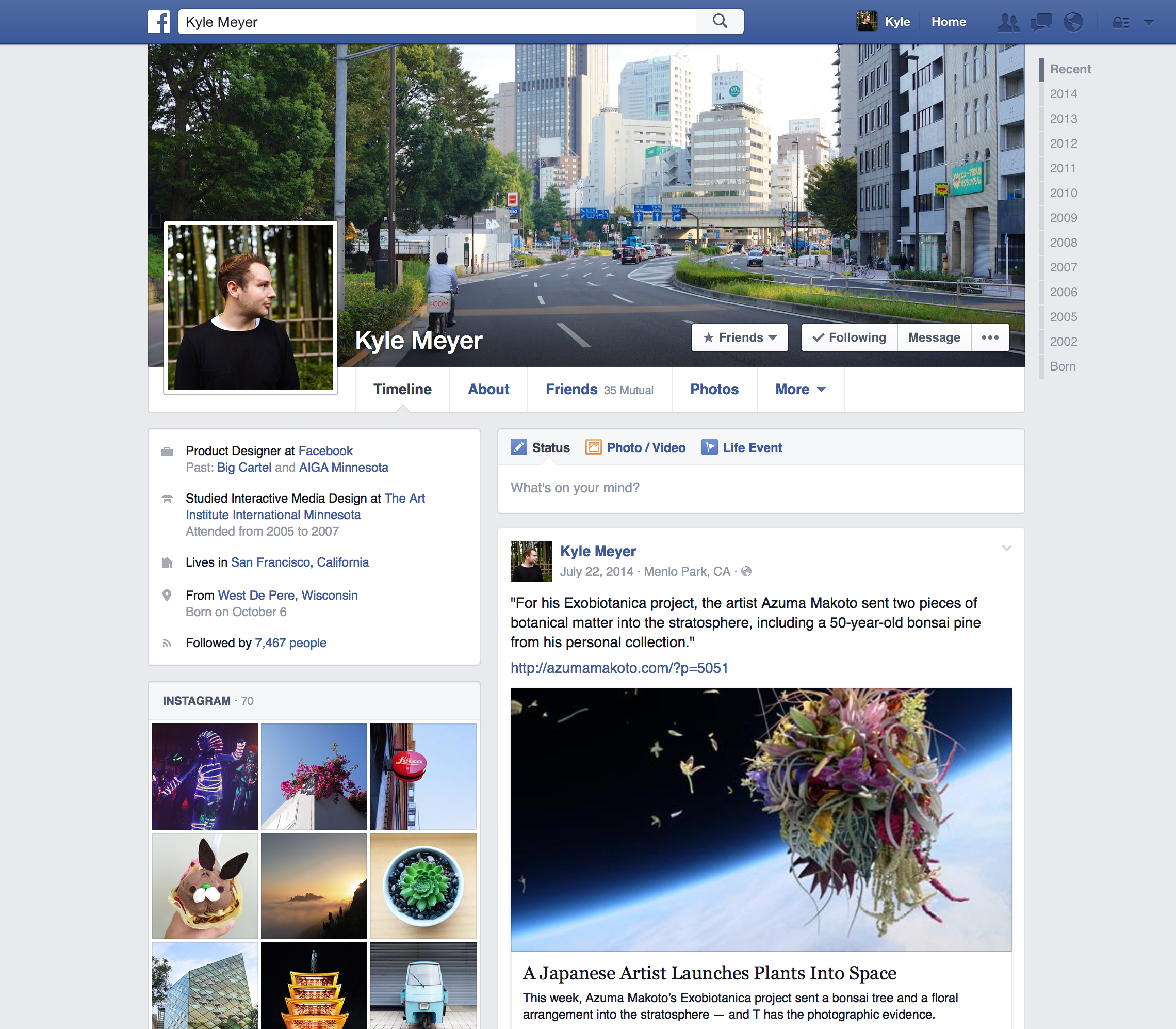
Facebook Timeline
2012 – 2013 with Wilson Miner
-
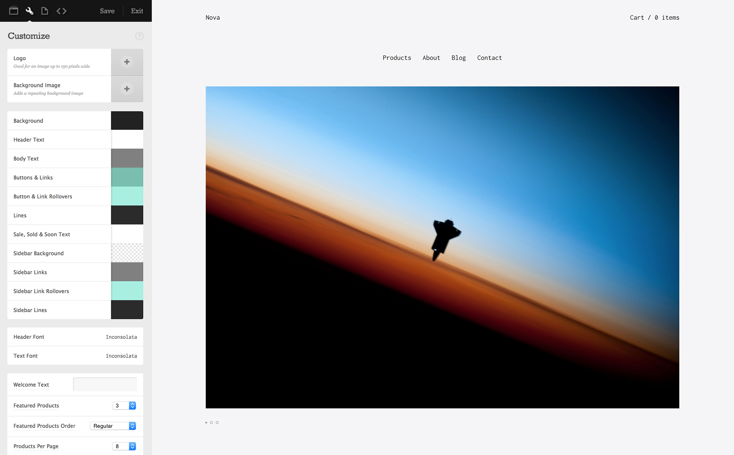
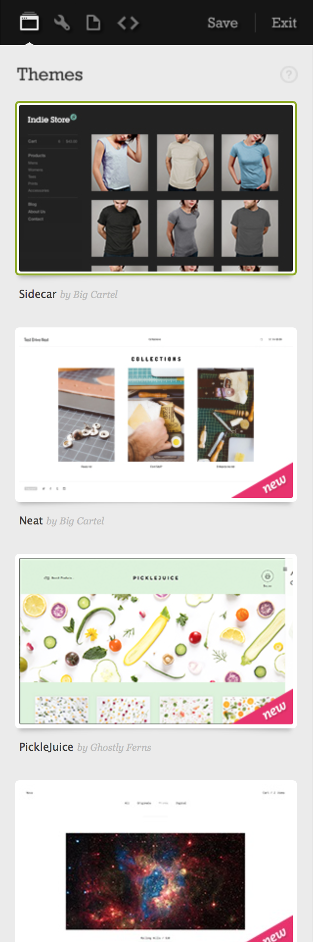
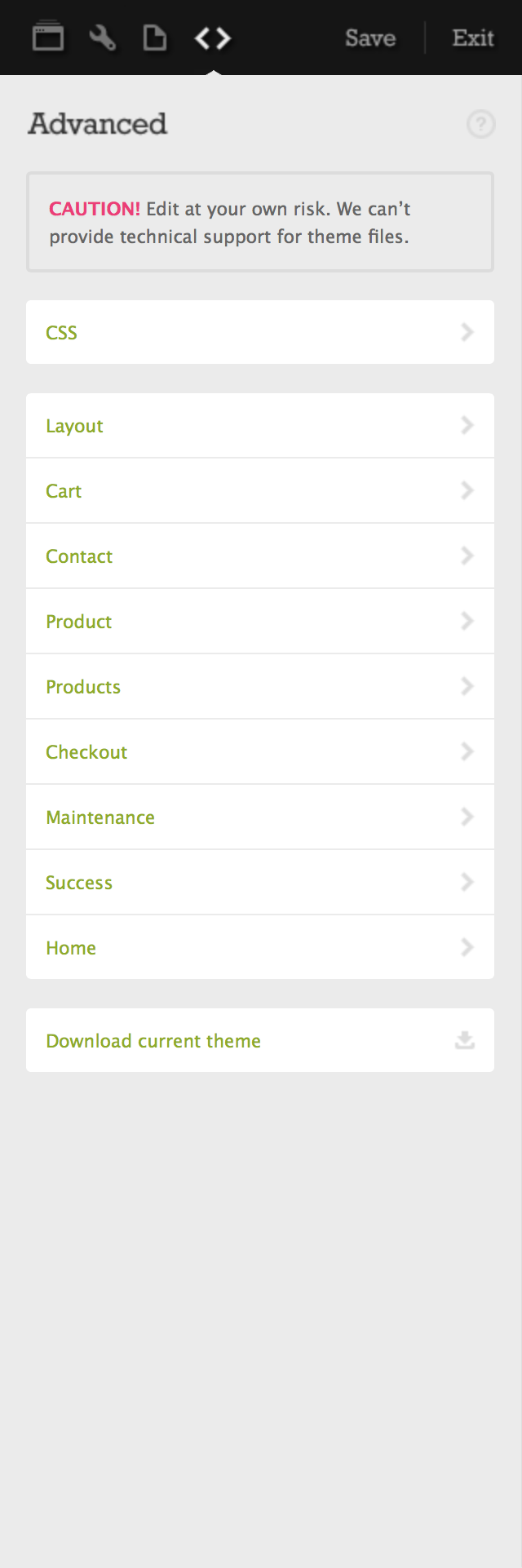
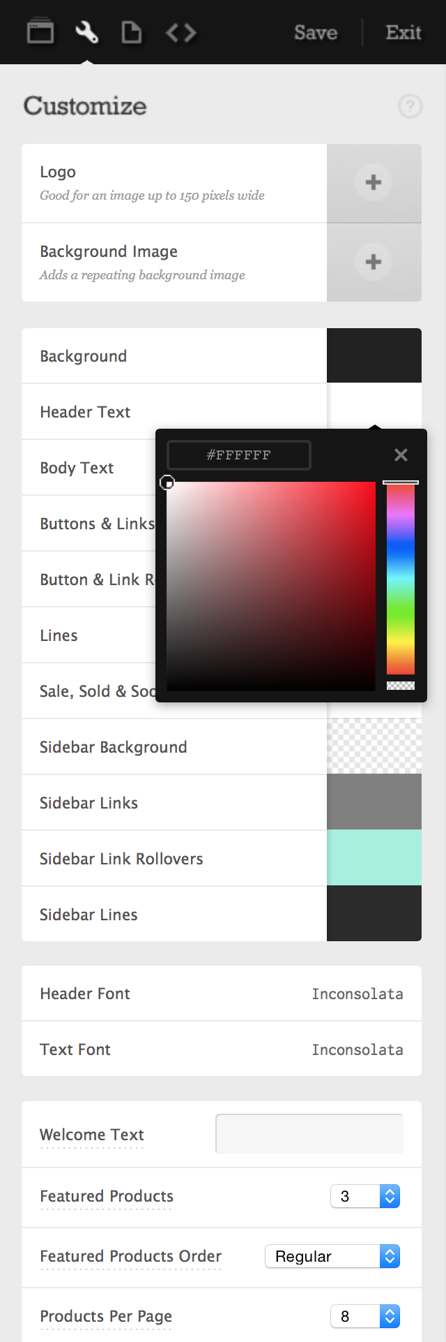
Big Cartel Store Customization
2011
-
Misc
2007 – 2012